
Japanese Skincare Packaging
Instructor: Paul Sheriff
Fonts: BN Mainz, Bicyclette
Software: Adobe Illustrator
Featured on Design Rush’s Best Packaging Designs of 2023
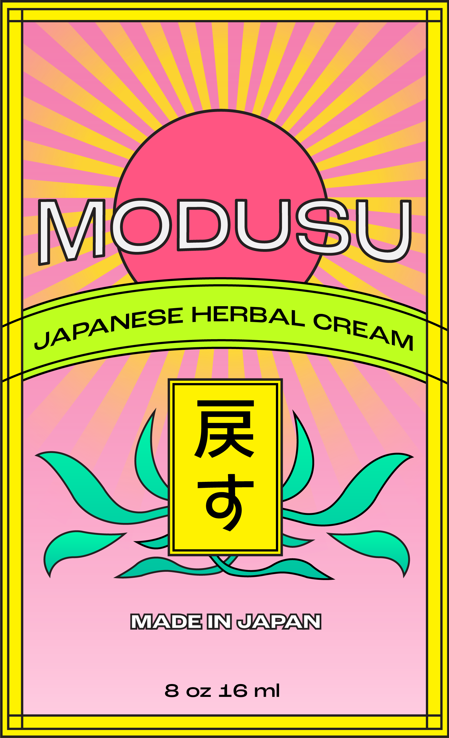
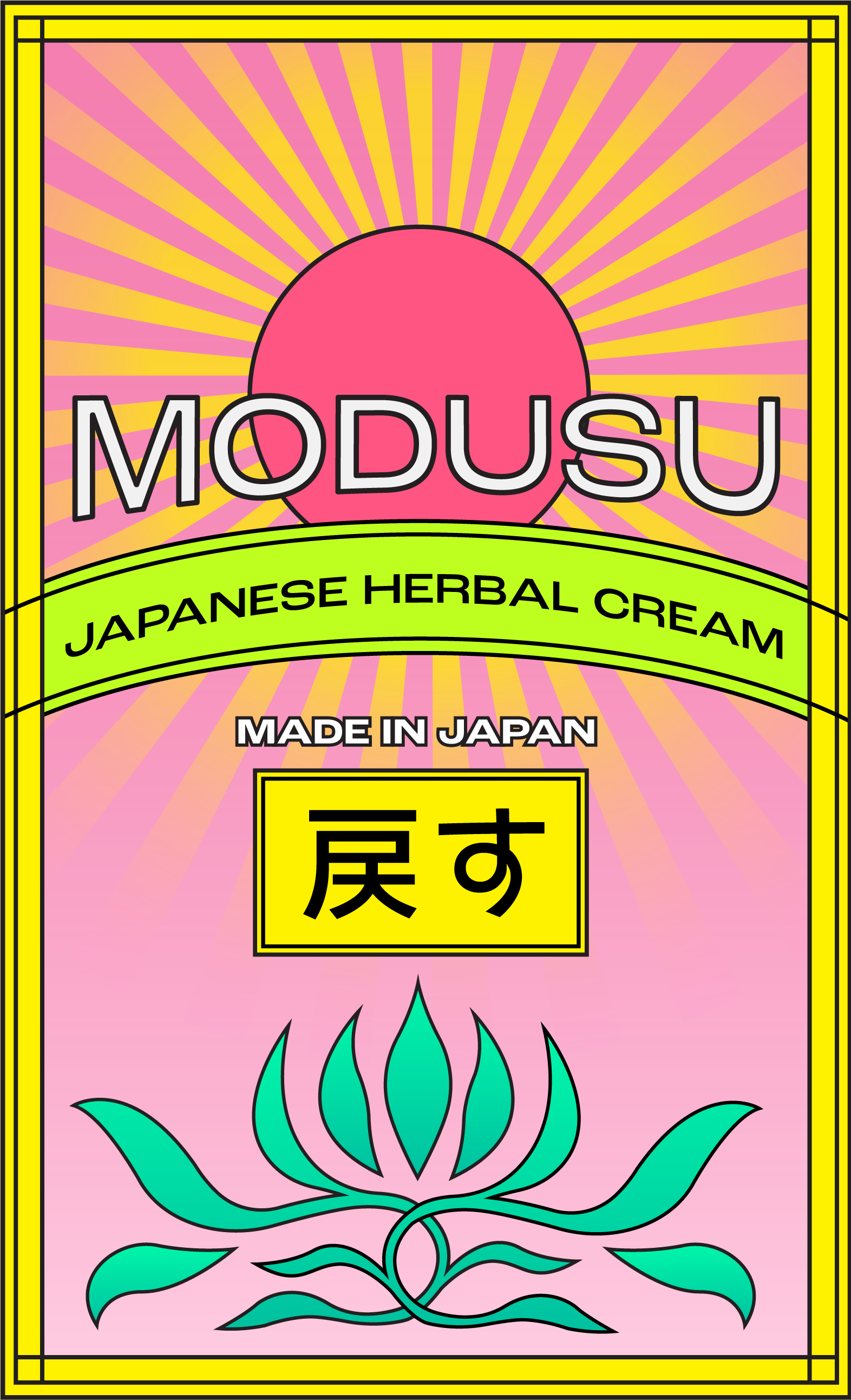
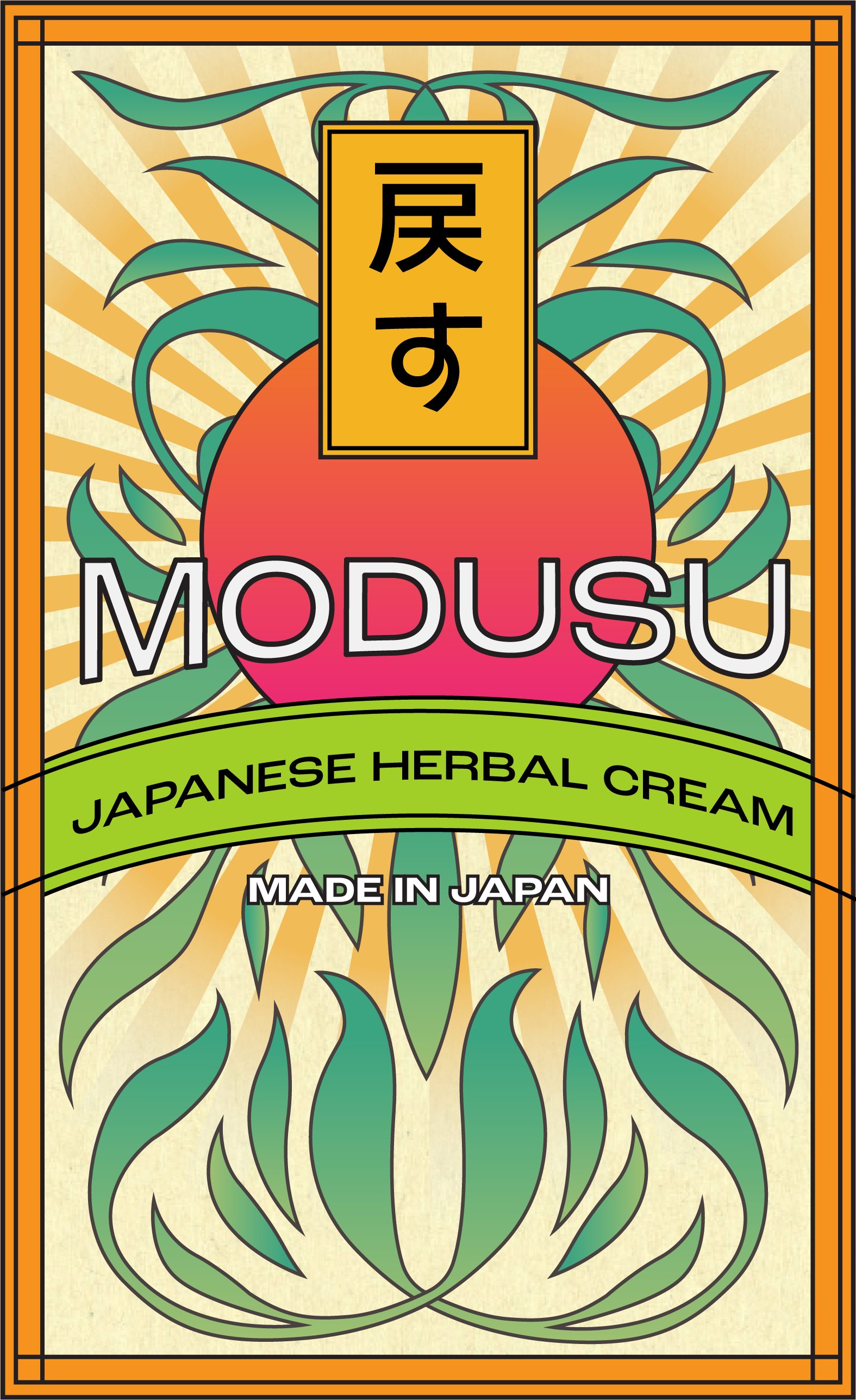
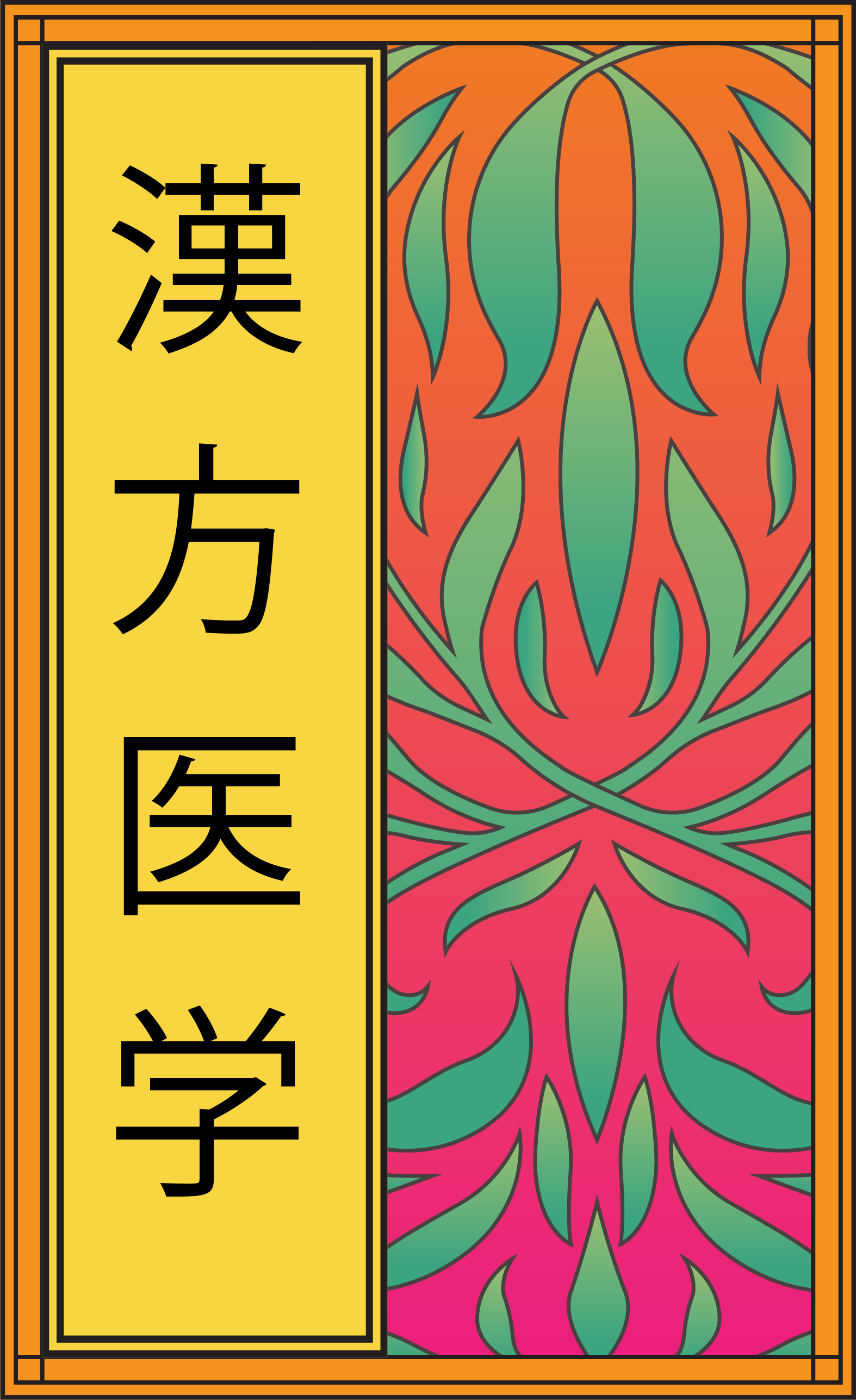
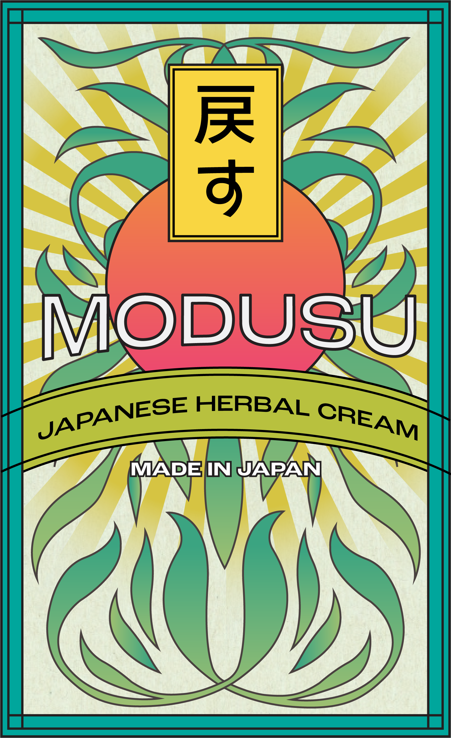
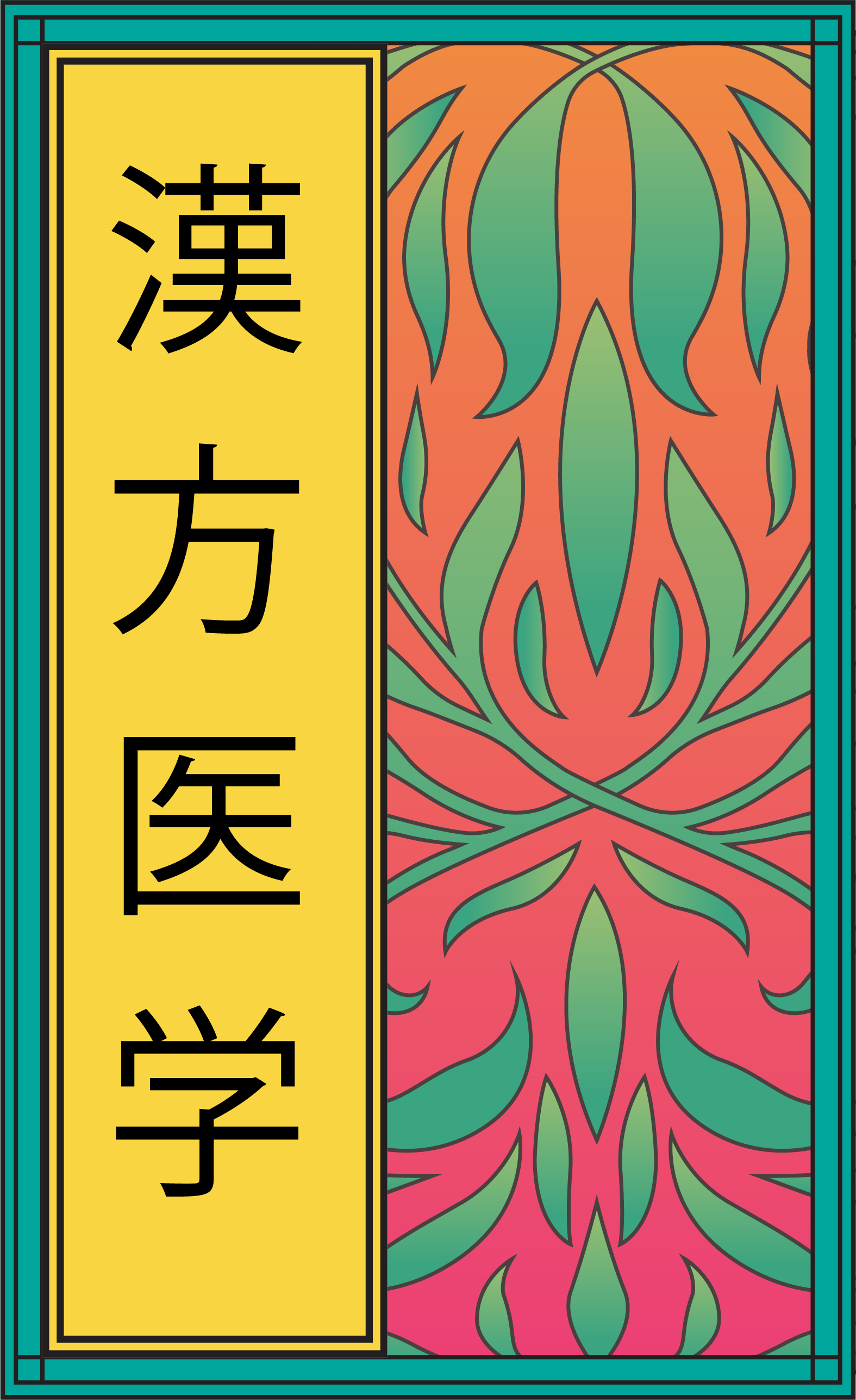
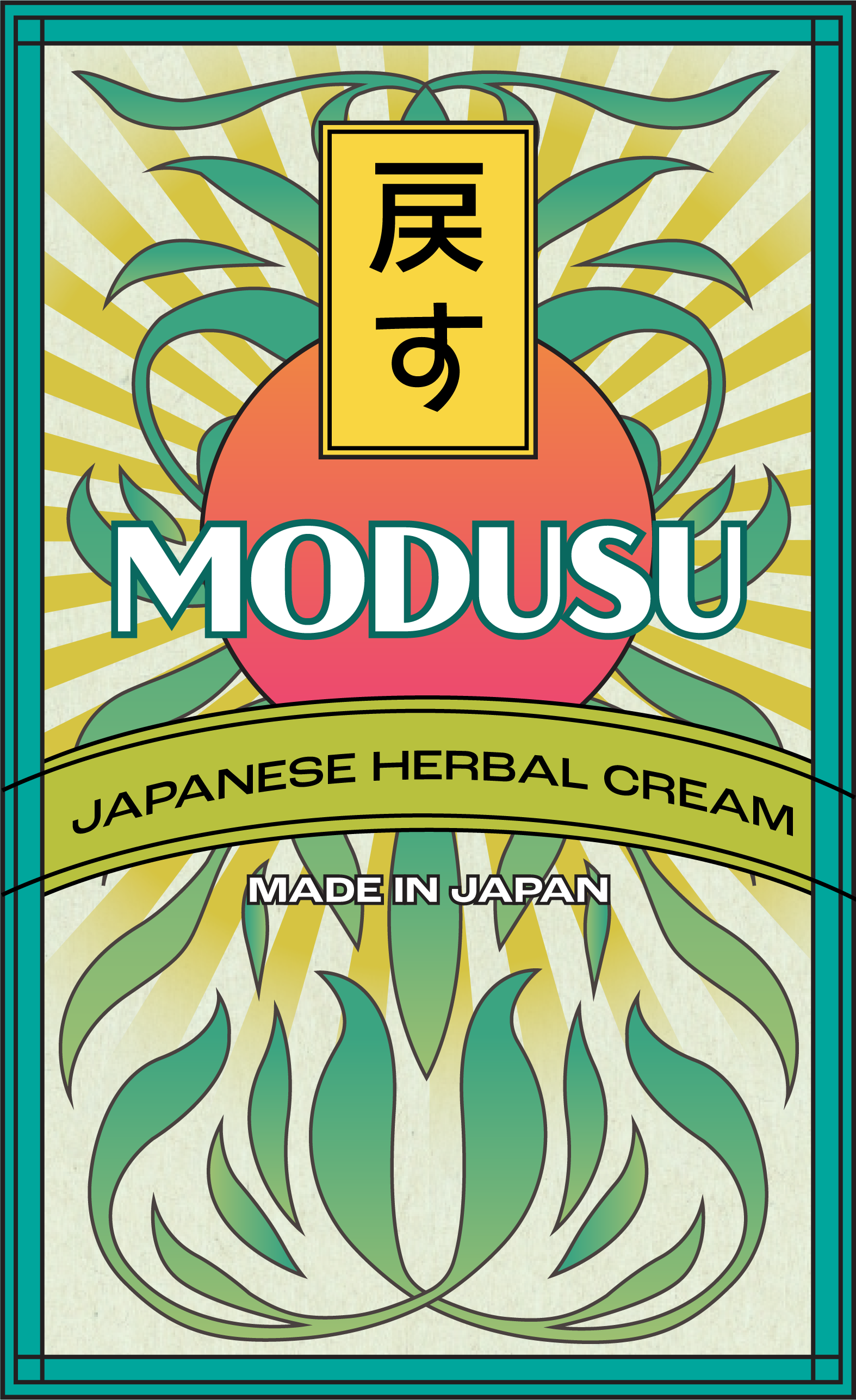
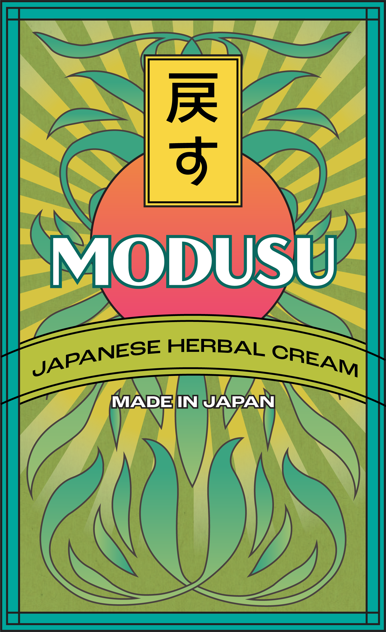
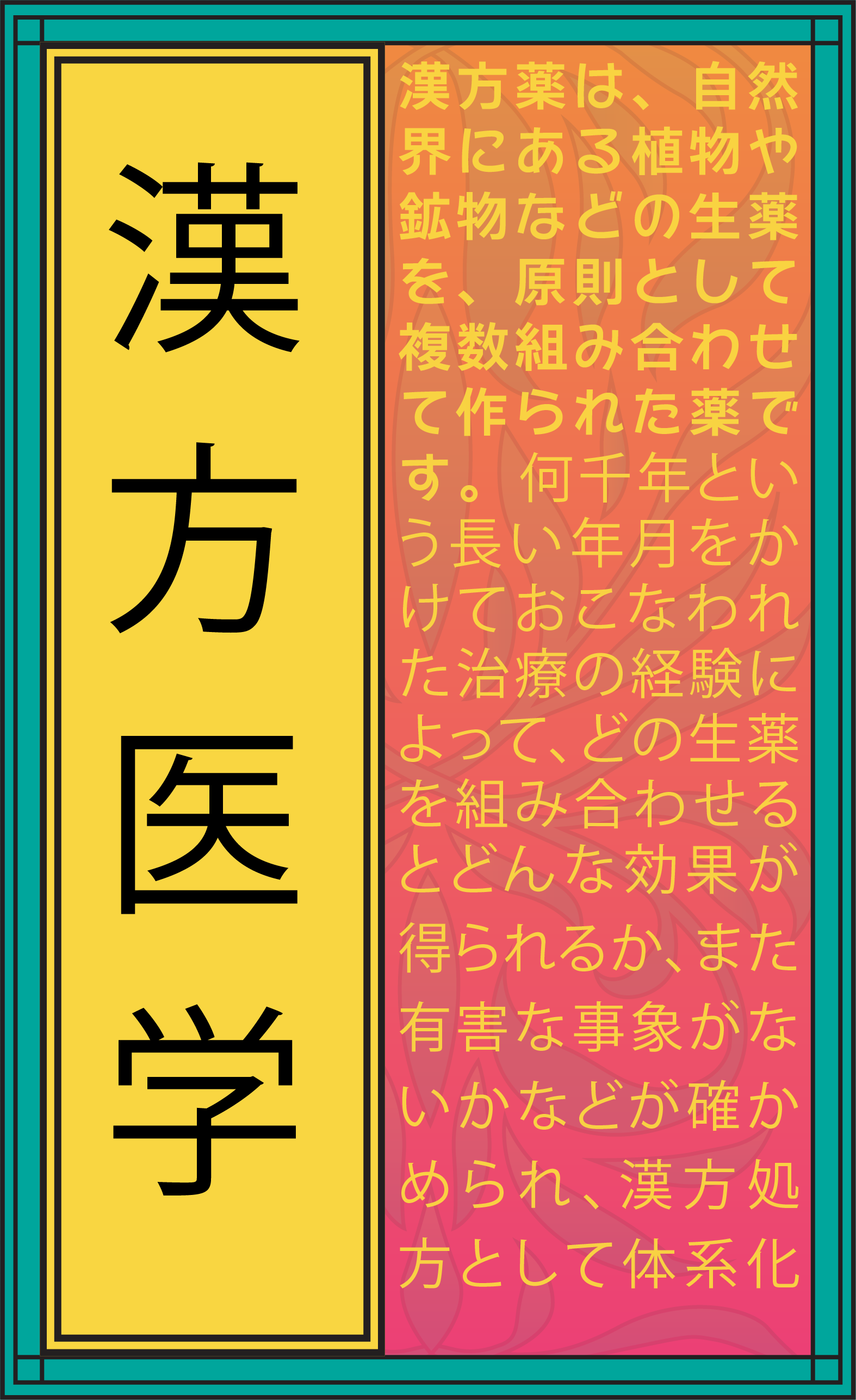
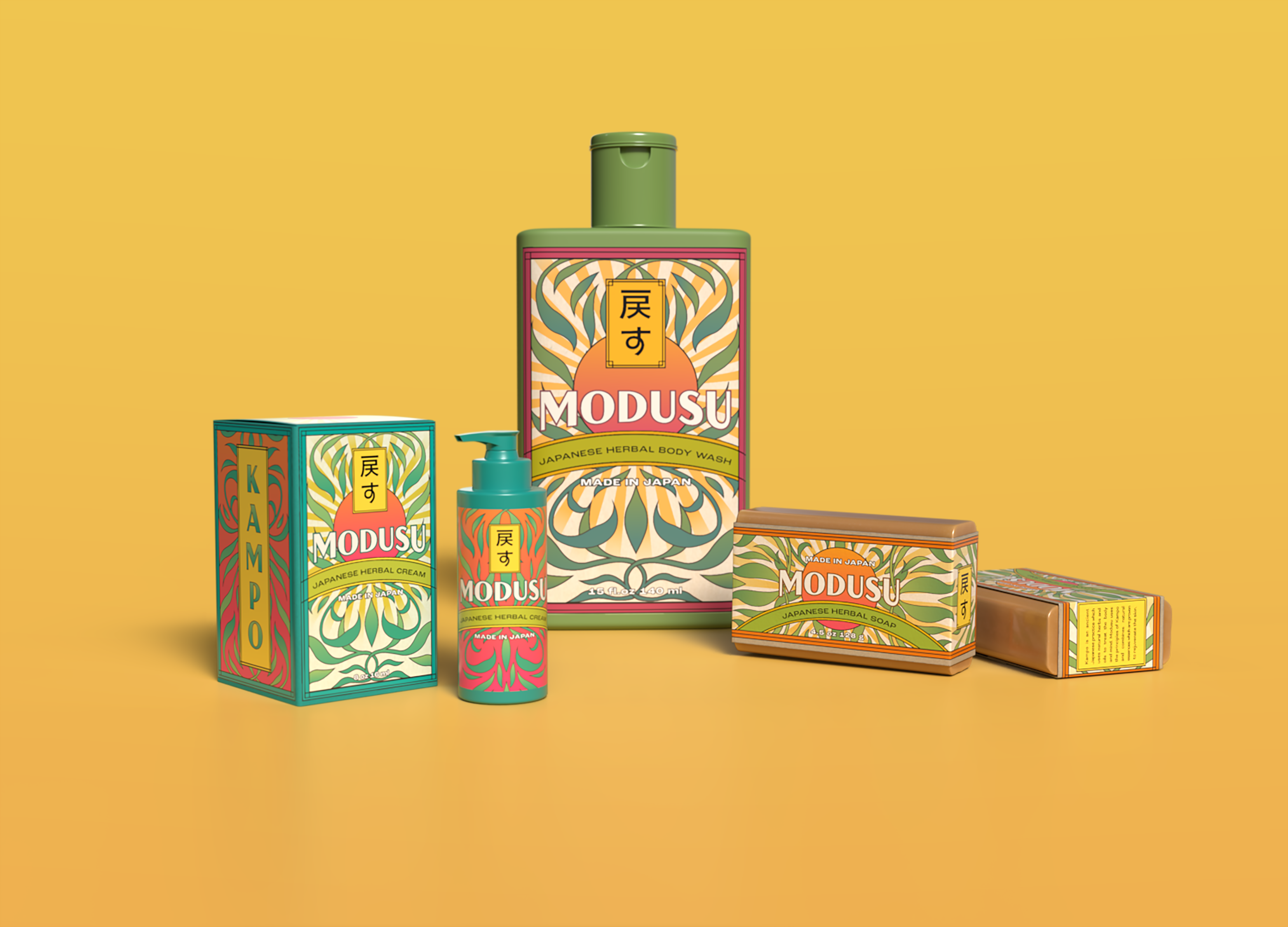
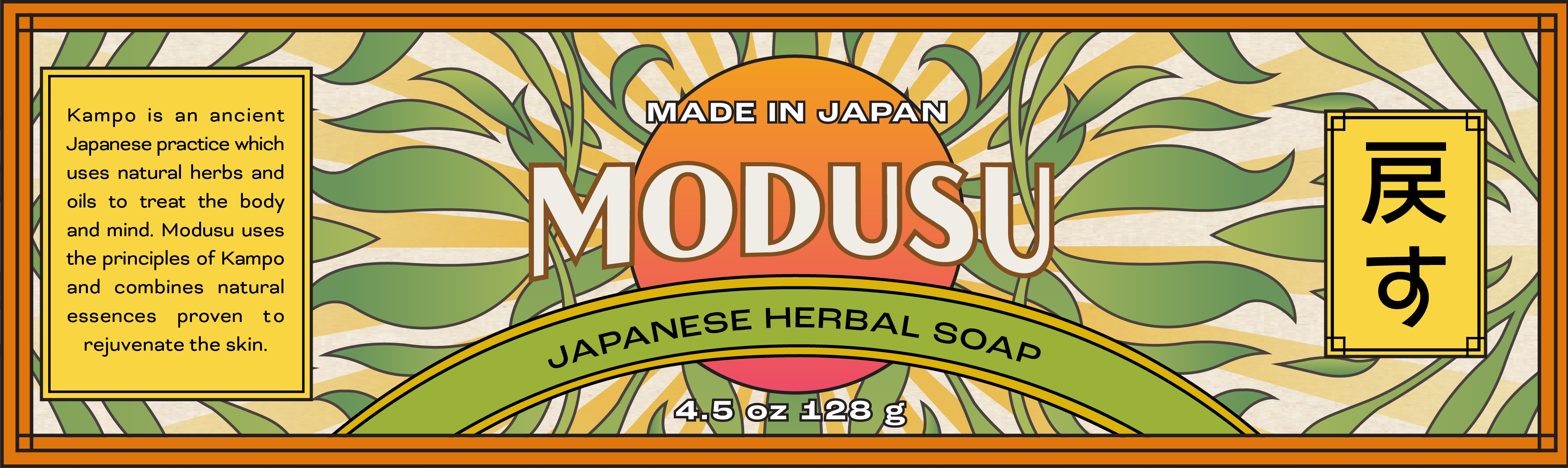
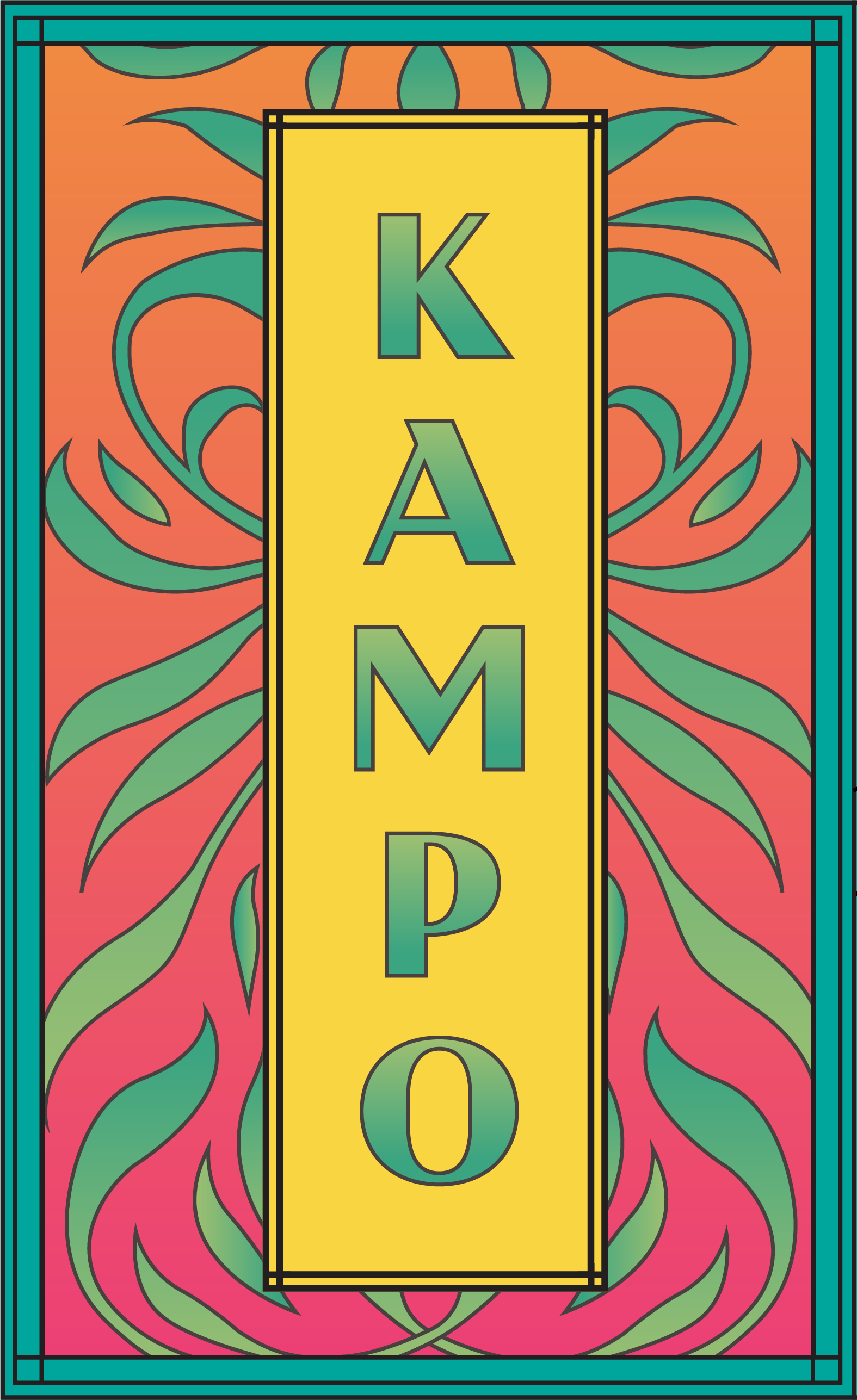
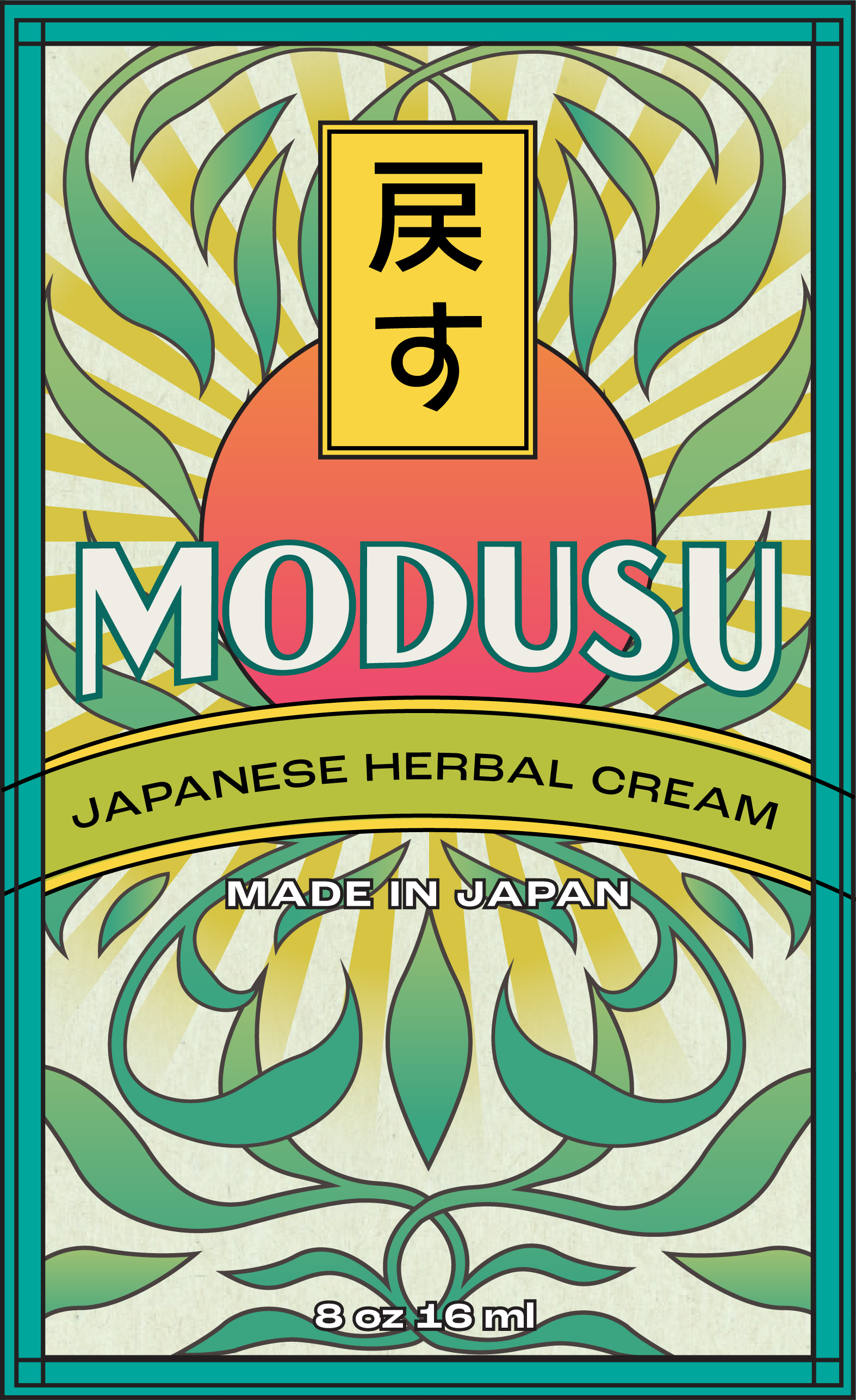
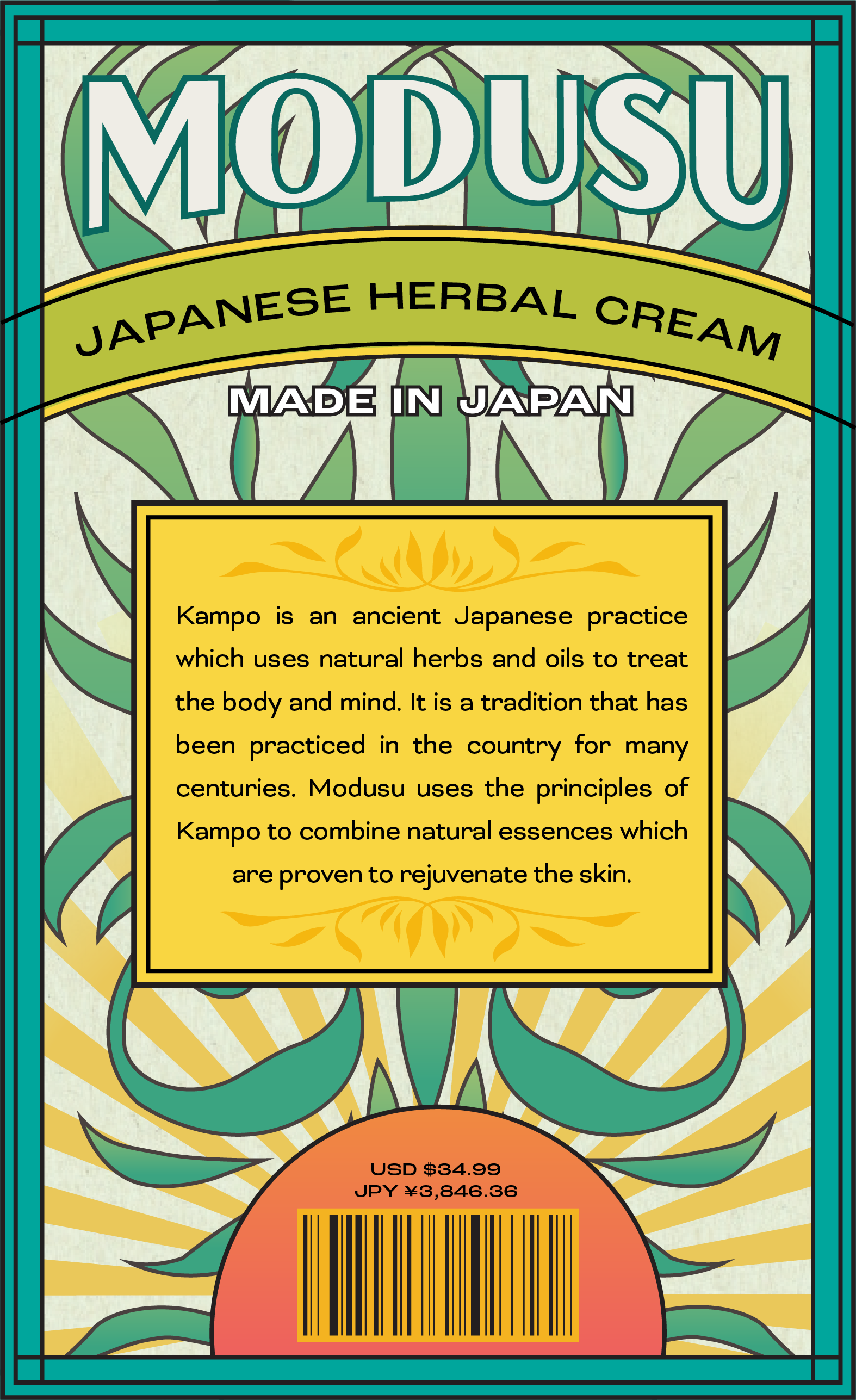
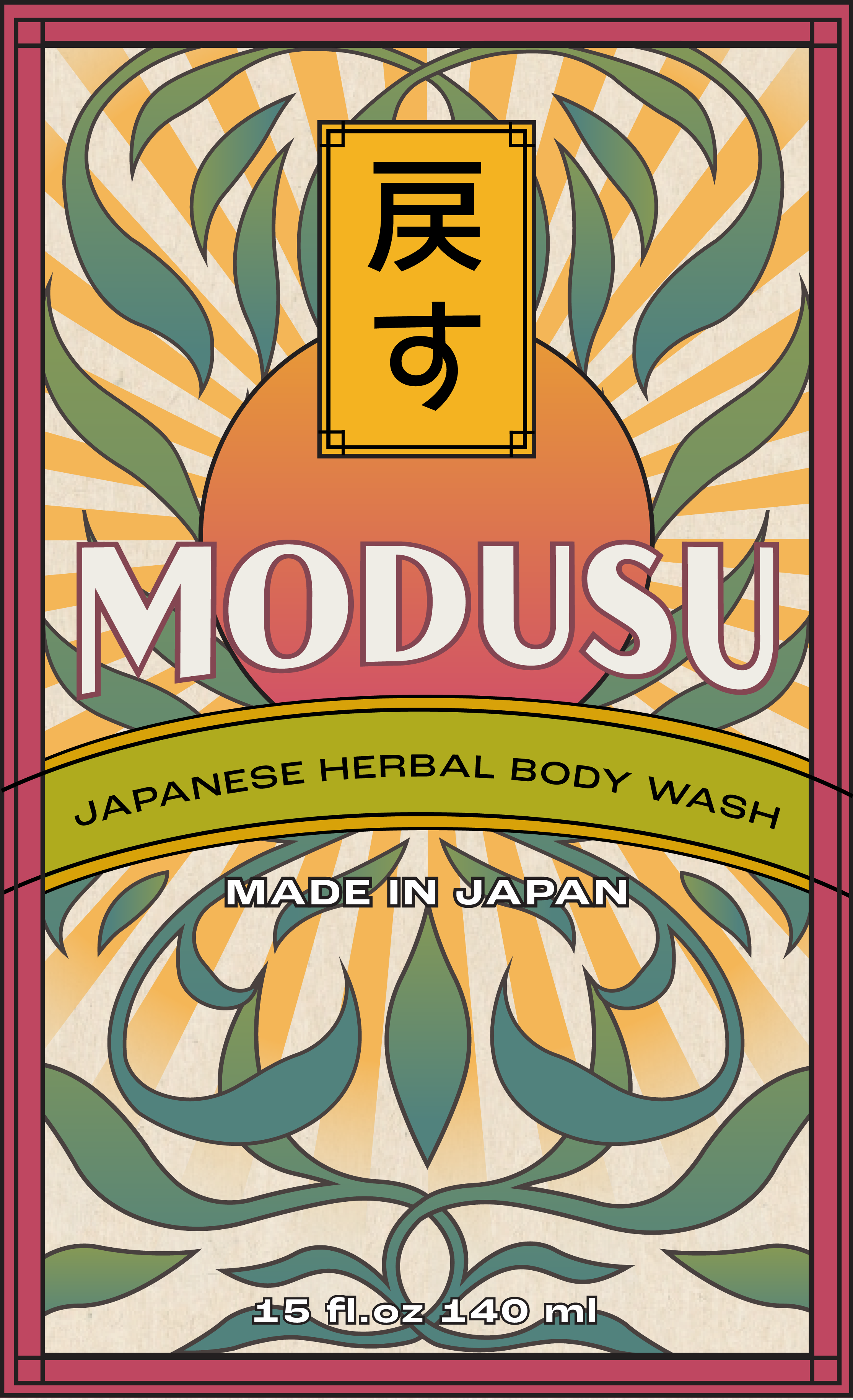
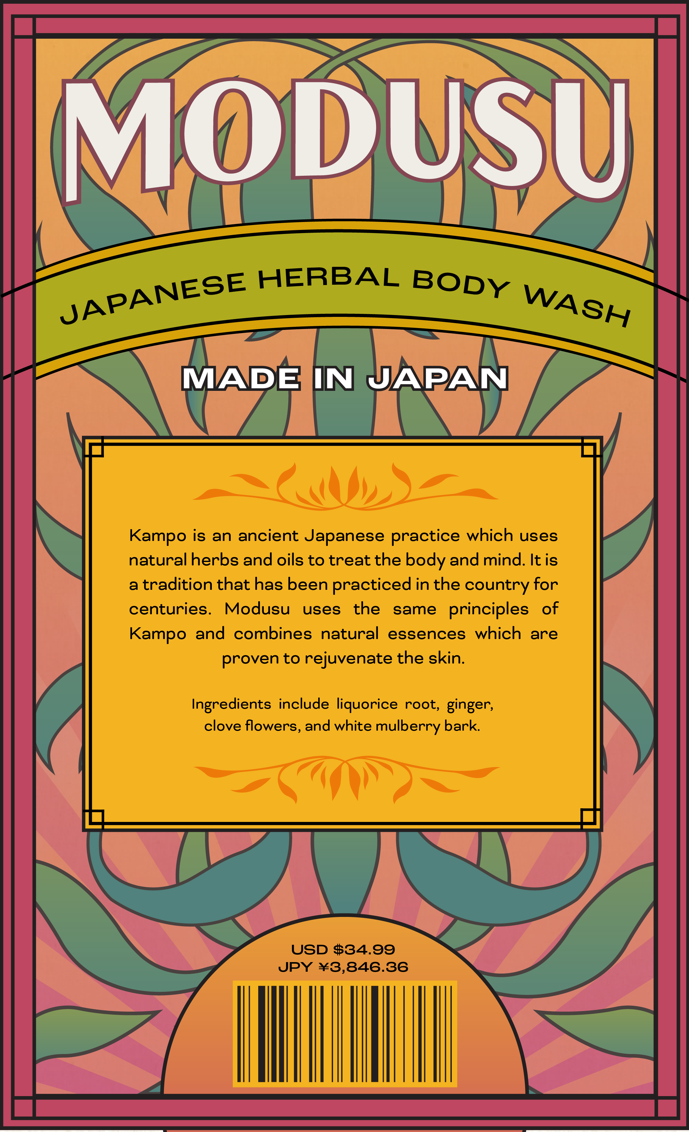
Modusu is the Japanese word for "restore," and this line of skin care serves that very purpose. Modusu is meant to soothe and rejuvenate the skin through the practice of Kampo, an ancient Japanese practice of treating the mind and body with natural extracts. The design draws inspiration from the bold colors and eclectic use of space in the work of Tanadori Yakoo, a Japanese designer whose work became widely recognized in 1965. The design lends itself to a variety of color palettes so that each product in the line can be distinct, while still using the same visual elements to form a cohesive brand.


Color
Each product part of the Modusu line has its own color scheme to make sure that they are easy to differentiate on the shelf. The warm oranges on the soap correlate to the soothing tones of cloves and ginger which brighten and nourish the skin. Meanwhile, the cool teals and greens on the herbal cream draw inspiration from the gentle white mulberry tree which has been used in Kampo medicine for centuries. The rich purple on the body wash alludes to the deep scents of Japanese licorice and chicory root.


Process
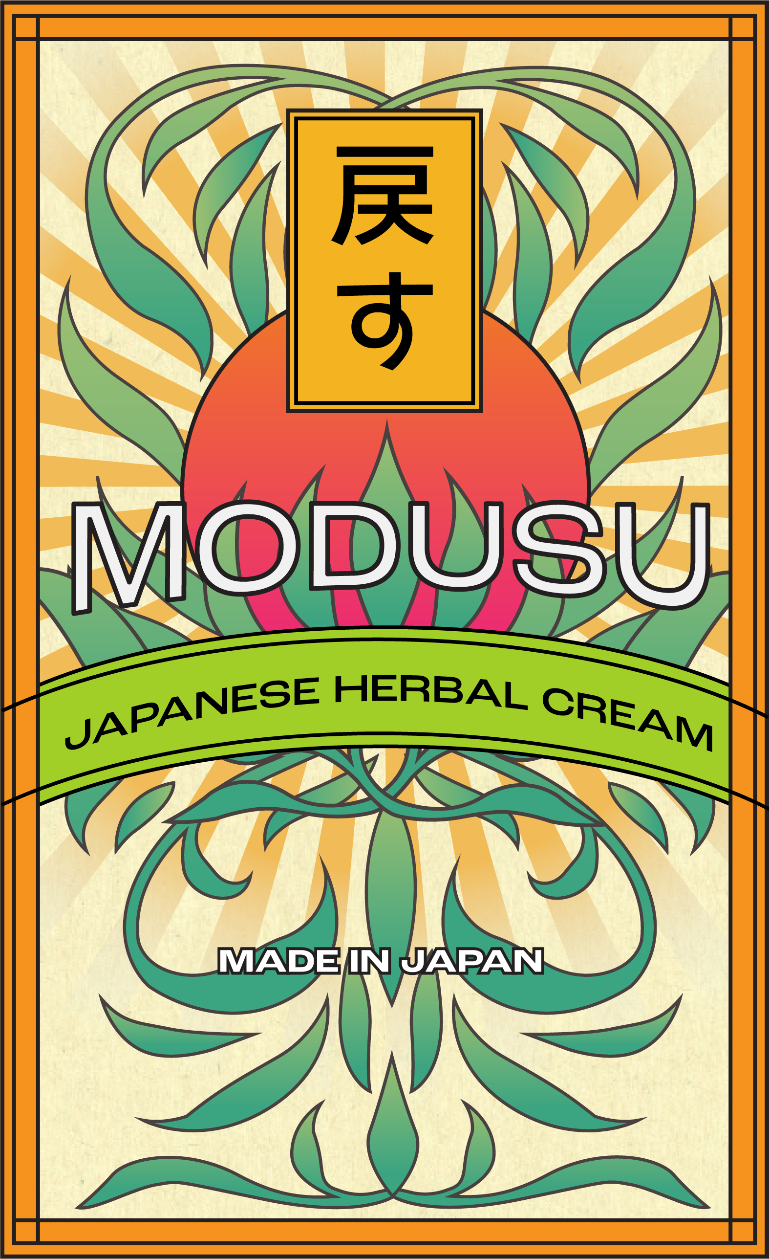
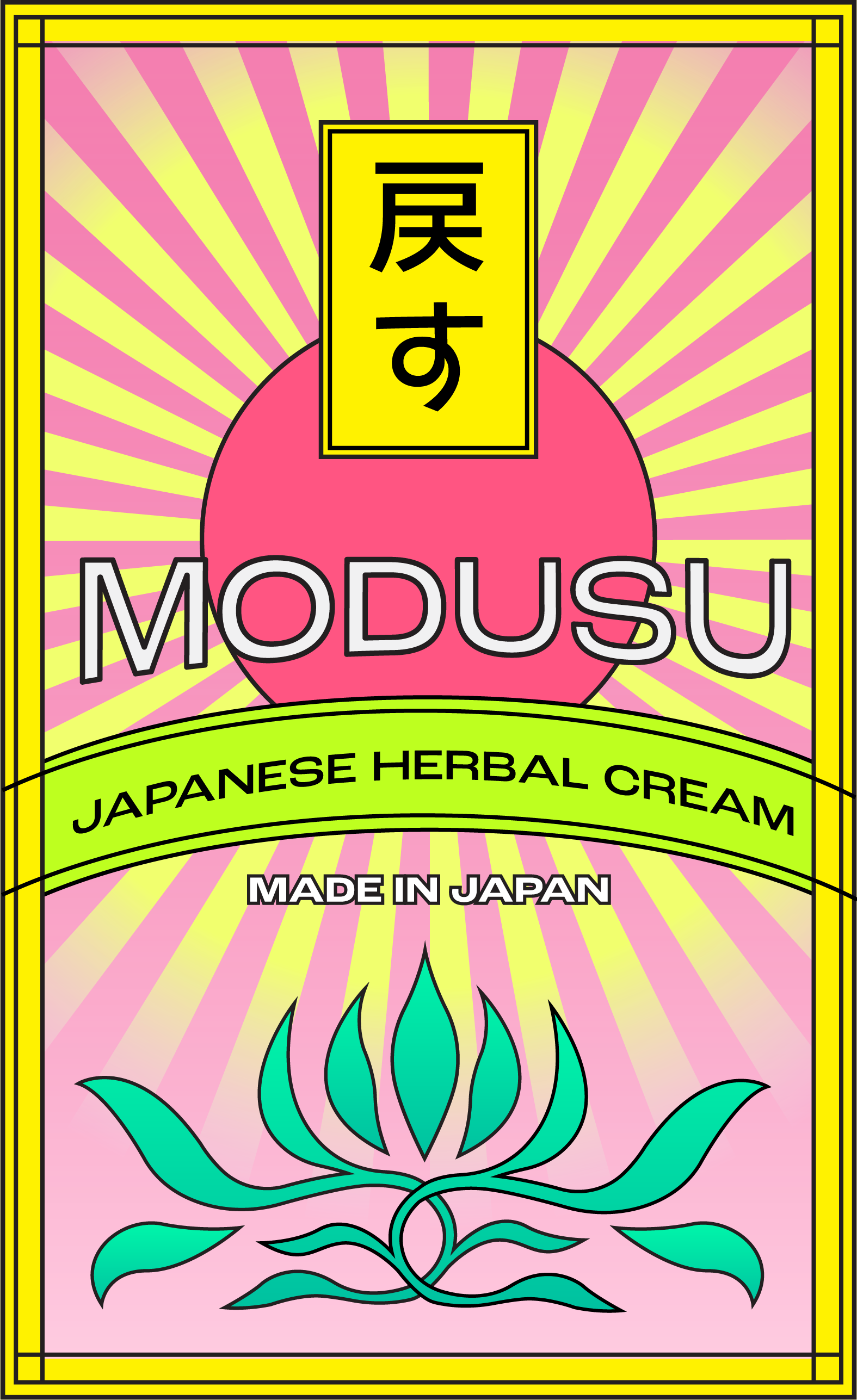
I went through many different variations on the layout and design for this project before landing on the finals. The colors that I had chosen initially turned out to be too vibrant, and as my professor called them, “too radioactive”. From there, I decided to mute down my colors and go for a more earth-toned theme to help the product convey its holistic and herbal nature.